7 Design Tricks to Make Your Website Feel Like a Native Mobile App
Transform your website's UX with mobile app design patterns. Learn bottom navigation, native transitions, pull-to-refresh, and more UI tricks that blur the line between web and native.
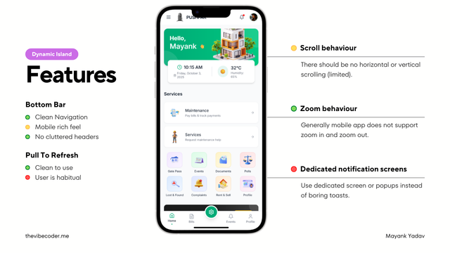
Users spend 90% of their mobile time in apps, not browsers. Why? Because native apps feel smoother, more intuitive, and more responsive. But here's the thing: you can achieve that same feel on the web with the right design patterns.
Whether you're building a PWA or just want your website to feel more app-like on mobile, these seven design tricks will transform your user experience. Let's dive in.
Why This Matters
The line between web and native is blurring. Instagram, Twitter, and Spotify all use these patterns in their PWAs. Master these techniques, and your users won't even realize they're using a website.
Ditch the Header, Use Bottom Navigation

Traditional website headers are terrible for mobile. They eat up screen real estate and force users to reach up (awkward on large phones). Bottom navigation bars are where it's at.
Why Bottom Navigation Wins:
- •Thumb-friendly: Easy to reach on any phone size
- •Always visible: No need to scroll up to navigate
- •Familiar pattern: Every major app uses it (Instagram, Twitter, TikTok)
- •More screen space: Content takes center stage
<nav className="fixed bottom-0 left-0 right-0 bg-white dark:bg-slate-900
                border-t border-slate-200 dark:border-slate-800
                safe-area-inset-bottom z-50">
  <div className="flex justify-around items-center h-16 px-4">
    <NavItem icon={<Home />} label="Home" active />
    <NavItem icon={<Search />} label="Search" />
    <NavItem icon={<PlusCircle />} label="Create" />
    <NavItem icon={<Bell />} label="Notifications" />
    <NavItem icon={<User />} label="Profile" />
  </div>
</nav>
Pro tip: Keep it to 3-5 items maximum. More than that, and it gets cluttered.
Skip Toasts, Use Full-Screen Notifications

Website developers love toast notifications—those little popups that appear and disappear. Mobile apps? They use dedicated notification screens and modal dialogs that demand attention.
❌ Web Pattern
- • Small toast in corner
- • Auto-dismisses in 3 seconds
- • Easy to miss
- • Multiple toasts stack weirdly
✓ App Pattern
- • Full-width notification banner
- • Slide-down from top animation
- • Clear action buttons
- • Dismissible with swipe gesture
<div className="fixed top-0 left-0 right-0 z-50
                animate-slide-down safe-area-inset-top">
  <div className="bg-green-500 text-white p-4 shadow-lg">
    <div className="flex items-center justify-between">
      <div className="flex items-center gap-3">
        <CheckCircle className="w-6 h-6" />
        <div>
          <p className="font-semibold">Post Published</p>
          <p className="text-sm opacity-90">Your article is now live</p>
        </div>
      </div>
      <button className="text-white/80 hover:text-white">
        <X className="w-5 h-5" />
      </button>
    </div>
  </div>
</div>
For critical actions (errors, confirmations), use modal dialogs that take over the screen. Users can't miss them, and they feel more intentional.
Fix Your Scroll Behavior
Websites love infinite vertical scroll and horizontal carousels. Mobile apps are more deliberate about scrolling—it should feel snappy and intentional, not endless.
App-Like Scroll Patterns:
- 1.Snap scrolling: Content snaps to specific positions (like Instagram Stories)
- 2.Pagination: Use "Load More" instead of infinite scroll
- 3.Momentum scrolling: Smooth, physics-based deceleration
- 4.Bounce effect: Rubber band effect at scroll edges (iOS style)
/* Enable smooth, native-like scrolling */
.scroll-container {
  overflow-y: auto;
  -webkit-overflow-scrolling: touch; /* iOS momentum */
  scroll-behavior: smooth;
  overscroll-behavior: contain; /* Prevent pull-to-refresh on nested scrolls */
}

/* Snap scrolling for carousels */
.snap-scroll {
  scroll-snap-type: x mandatory;
  scroll-padding: 0 20px;
}

.snap-item {
  scroll-snap-align: start;
  scroll-snap-stop: always;
}
Avoid horizontal scroll unless it's intentional (like a carousel). Random horizontal scrolling screams "website" to users.
Control Zoom Behavior

Native apps don't let you pinch-to-zoom on UI elements (unless you're in a photo viewer). Your app-like website shouldn't either.
Why Disable Zoom?
Mobile apps feel compact and controlled. When users can zoom, it breaks that illusion. Plus, accidental zooming is annoying.
Note: Only do this if your design is already mobile-optimized with readable text sizes. Accessibility matters!
<meta
  name="viewport"
  content="width=device-width,
           initial-scale=1,
           maximum-scale=1,
           user-scalable=no"
/>

<!-- Or use CSS for specific elements -->
<style>
  * {
    touch-action: manipulation; /* Prevents double-tap zoom */
  }

  input, textarea {
    font-size: 16px; /* Prevents iOS zoom on focus */
  }
</style>Add Smooth Page Transitions
Websites: instant page loads with jarring flashes. Apps: smooth, animated transitions that guide the user's eye. The difference is night and day.
Slide Transitions
New pages slide in from the right (forward) or left (back). iOS style.
Fade Transitions
Smooth cross-fade between pages. Subtle and elegant.
Scale Transitions
Modal dialogs scale up from center. Great for overlays.
import { motion } from 'framer-motion'

export default function PageTransition({ children }) {
  return (
    <motion.div
      initial={{ x: 300, opacity: 0 }}
      animate={{ x: 0, opacity: 1 }}
      exit={{ x: -300, opacity: 0 }}
      transition={{
        type: 'spring',
        stiffness: 260,
        damping: 20
      }}
    >
      {children}
    </motion.div>
  )
}

// Usage in your router
<AnimatePresence mode="wait">
  <PageTransition key={pathname}>
    <YourPage />
  </PageTransition>
</AnimatePresence>
Keep transitions under 300ms. Any longer and they feel sluggish, not smooth.
Implement Pull-to-Refresh
This is the most iconic mobile app gesture. Pull down from the top to refresh content. It's intuitive, satisfying, and screams "native app."
What Makes Good Pull-to-Refresh:
- ✓Smooth drag animation that follows your finger
- ✓Loading spinner or custom animation
- ✓Haptic feedback when refresh triggers (if possible)
- ✓Snaps back naturally when released
import { useState, useRef } from 'react'

export default function PullToRefresh({ onRefresh, children }) {
  const [pulling, setPulling] = useState(false)
  const [pullDistance, setPullDistance] = useState(0)
  const startY = useRef(0)

  const handleTouchStart = (e) => {
    startY.current = e.touches[0].clientY
  }

  const handleTouchMove = (e) => {
    const currentY = e.touches[0].clientY
    const distance = currentY - startY.current

    if (distance > 0 && window.scrollY === 0) {
      setPulling(true)
      setPullDistance(Math.min(distance * 0.5, 100))
    }
  }

  const handleTouchEnd = async () => {
    if (pullDistance > 60) {
      await onRefresh()
    }
    setPulling(false)
    setPullDistance(0)
  }

  return (
    <div
      onTouchStart={handleTouchStart}
      onTouchMove={handleTouchMove}
      onTouchEnd={handleTouchEnd}
    >
      <div
        style={{
          transform: `translateY(${pullDistance}px)`,
          transition: pulling ? 'none' : 'transform 0.3s'
        }}
      >
        {pullDistance > 0 && (
          <div className="text-center py-4">
            <RefreshIcon
              className="animate-spin mx-auto"
              style={{ opacity: pullDistance / 60 }}
            />
          </div>
        )}
        {children}
      </div>
    </div>
  )
}
Libraries like react-pull-to-refresh or react-simple-pull-to-refresh make this even easier if you don't want to roll your own.
Bonus App-Like Patterns
Here are more subtle touches that separate amateur web apps from polished, app-like experiences:
Skeleton Screens
Instead of spinners, show gray placeholder boxes that match your content layout. Instagram, Facebook, and LinkedIn all do this. It feels faster even when it's not.
Swipe Gestures
Swipe to delete items from lists. Swipe between tabs. Swipe to go back. These gestures are second nature on mobile—use them.
Haptic Feedback
Use the Vibration API for subtle feedback on important actions. A tiny vibration when you like a post or complete a task adds physicality to digital interactions.
Safe Area Insets
Respect the notch on newer iPhones. Use CSS environment variables like safe-area-inset-top to avoid content being hidden behind the notch or home indicator.
Loading States
Never show blank white screens while loading. Show the navigation, skeleton content, or a branded splash screen. Users should always know something is happening.
Status Bar Styling
Control the phone's status bar color to match your app's theme. Use theme-color meta tags to make the experience seamless edge-to-edge.
/* Safe area insets for notched devices */
.header {
  padding-top: env(safe-area-inset-top);
}

.bottom-nav {
  padding-bottom: env(safe-area-inset-bottom);
}

/* Prevent text selection (app-like) */
* {
  -webkit-user-select: none;
  user-select: none;
}

input, textarea {
  -webkit-user-select: auto;
  user-select: auto;
}

/* Smooth animations */
* {
  -webkit-tap-highlight-color: transparent;
  transition-timing-function: cubic-bezier(0.4, 0, 0.2, 1);
}
Before vs After
| Pattern | Website Feel | App Feel |
|---|---|---|
| Navigation | Top header | Bottom tab bar |
| Alerts | Toast notifications | Full-width banners |
| Page Changes | Instant load | Slide transitions |
| Refresh | Reload button | Pull-to-refresh |
| Loading | Blank screen or spinner | Skeleton screens |
Start with bottom navigation and proper scroll behavior. Those two alone will make a massive difference. Then gradually add transitions, pull-to-refresh, and the other patterns as you refine your app.
Quick Implementation Checklist
- Replace top header with bottom navigation bar
- Add full-width notification banners instead of toasts
- Implement smooth scroll with momentum and bounce
- Disable zoom with proper viewport settings
- Add slide/fade transitions between pages
- Implement pull-to-refresh gesture
- Add skeleton loading screens
- Include safe area insets for notched devices
- Test on real devices (not just emulators)
Remember: apps aren't just about features. They're about feel. Get these patterns right, and users will forget they're even using a browser. That's when you know you've nailed it.
"The best websites feel in small screens feels like apps. The best apps feel invisible."
Want More Mobile UX Tips?
Subscribe to The Vibe Coder for deep dives into mobile design patterns, PWA development, and building app-like web experiences that users love.